CALLIGRAPHY, NOTES BRITISH MASTER SCRIBE Donald Jackson, requires the whole body. The energy, skill, muscle memory, and focus which Serena Williams drives into her arm’s wide sweep of the tennis racket—all of that is distilled into the small strokes of the hand scribing beautiful letters. Those viewing his work, Jackson attests, can trace his body and breath in his lines.
Jackson is famous for the Saint John’s Bible, an illuminated manuscript of the Catholic Bible he created in concert with a team of artists and the Benedictine monks of Saint John’s Abbey in Minnesota. This unique project, finished in 2011 and billed as “America’s Book of Kells,” is the first handwritten, hand-illustrated Catholic Bible of its scale and quality since the time of Gutenberg. I have shown, taught, and gazed at this Bible for five years. Like many viewers, at first I was most entranced by its artwork, visual meditations on beloved passages of scripture. But as I began to practice calligraphy—what better way to train the eye than by training the hand?—I came to appreciate calligraphy as more than mere pretty letters. How, I now wonder, does calligraphy mean? What aesthetic senses, what theological affordances does it carry, for both Christians and Jews?
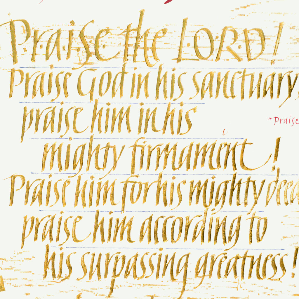
Sally Mae Joseph. Psalm 150 (detail), 2004. From the Saint John’s Bible. Gilding on vellum. 6 x 4½ inches.
Several works from living artists suggest possibilities. Jackson describes his art as “painting with words.” I add that calligraphy is music on the page. In the Saint John’s Bible, Sally Mae Joseph offers a gilded treatment of Psalm 150, a psalm itself packed with instrumental imagery. The calligrapher arranges her text spatially, just as a composer or songwriter arranges her text temporally. Here the psalm opens at a loud volume: Praise the Lord! The sharp italic letters and tight texture of this block of text, with so little space between words and lines, convey a full chorus of singers. To balance that, several lines end on long notes—the wide loops in the t of “firmament,” the e of “dance,” and the h of “with.” The thin golden lines that surround the text are oscillographs, visualizations of sound waves—the monks of Saint John’s Abbey chanting psalms in the daily Divine Office. The monks’ aural presence reminds us that the Psalms are oral and communal. Similarly, the spatial arrangement sets our eye’s pace as we scan the lines, pausing on the long notes. Whether we realize it or not, all letters have personalities: can you imagine a Bible in Comic Sans? These gilded letters are rhythmic.
Ann Hechle, another British calligrapher of Jackson’s generation, likewise uses her medium to explore the imagistic potential of letters and words. In her 1988 Be Still Then and Know that I Am God, she uses the enigmatic Psalm 46:10 to produce the calligrapher’s equivalent of variations on a theme, typically a musical genre. These six variations explore the meaning of this weighted phrase in several ways, like an actor rehearsing lines with different intonations and emphases. The first one, at top left, seems to be a relatively plain rendering, but the rest each emphasize different aspects of the line. She uses line-breaks as oral pauses on the page, thus changing the meaning of the verse, as in the difference between “Be still then / know that I am God” and “Be still then / know / that I am God,” and the bottom-middle’s “Be still then! … and know that I am God,” with the second part seemingly “spoken” more softly than the first.
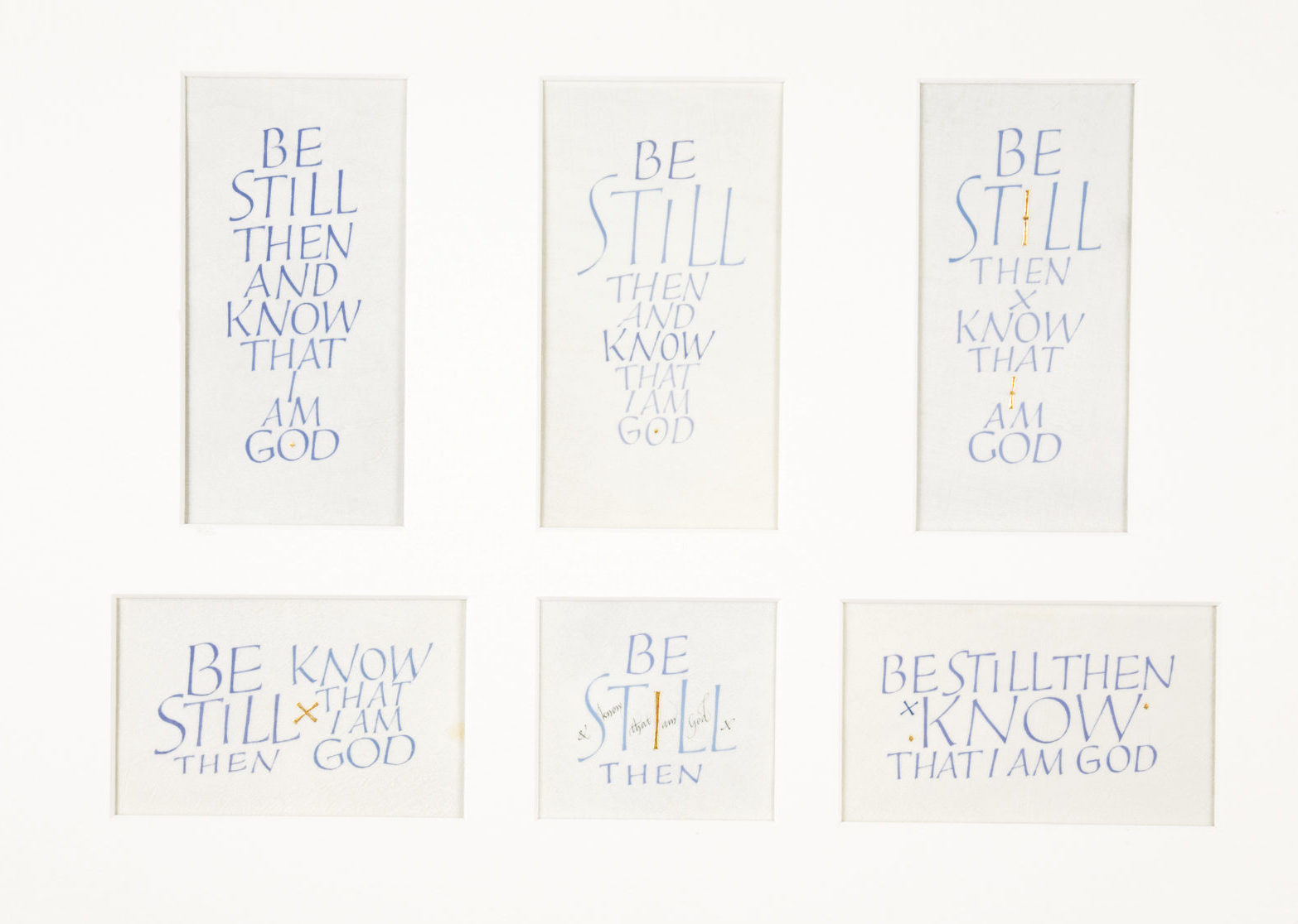
Ann Hechle. Be Still Then and Know that I Am God, 1988. Calligraphy on vellum. 12¼ x 16 inches. Collection of the Fitzwilliam Museum, Cambridge.
For the calligrapher, words are always flesh. Hechle is particularly attracted to synchronicities between the visual forms of letters and the meanings of words, just as a poet plays with sound and meaning through consonance and alliteration. In the top-middle variation, for example, the stillness of “STILL” is emphasized by its tall, upright letters, contrasted with the italicized, non-vertical letters of the rest of the line. In the top-right variation, she uses gold—a traditional symbol of God’s presence—to connect the I in “STILL” with the I of “I AM GOD,” visually connecting the peace of the psalmist with the presence of the great I AM. She finds a good deal of meaning in the fact that when written in Roman capitals, the word “GOD” is symmetrical, the left-hand curve of the G and the right-hand curve of the D echoing both each other and the O they encircle. The symmetry of the word “GOD” echoes the sense of order and structure which God conveys to the cosmos in biblical understandings of creation. Art historians, by the way, call this the “iconicity of script.” Script is image.
The Word made flesh is, I suspect, calligraphy’s ripest Christian theological potential. One can see it in the famous chi-rho page of the Book of Kells, in which the letters’ alleged purpose of conveying information is thoroughly overwhelmed by mesmerizing geometry. To those of us straddling print and digital eras, “text” often seems like a platonic form in the ether. But for most of human history, letters were sculpted and shaped by the attention and skill of fleshly hands. These hands often used fleshly tools—quills made from turkey, goose, or swan feathers. They often wrote on fleshly surfaces—skins of calves, sheep, and goats—the smooth and untearable vellum which no paper yet rivals.
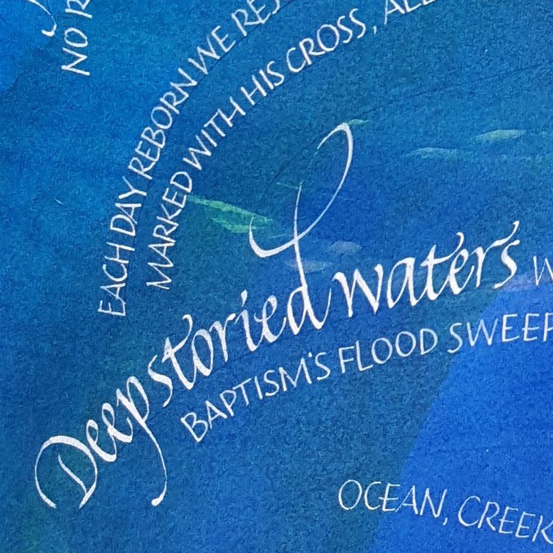
Laura R. Norton (artist) and Paul E. Hoffman (lyricist). No Deeper Well (detail), 2019. Watercolor and acrylic on paper. 11 x 14 inches.
Calligraphic form and theological content also mingle in the work of Laura Norton, a calligrapher in the Pacific Northwest. Norton intertwines her work with Christian spirituality and produces weekly calligraphic meditations on the Revised Common Lectionary. In her calligraphic treatment of Paul Hoffman’s “No Deeper Well,” a hymn with extensive baptismal imagery, the letters flow like a winding river, sending the reader’s eye upward to craft an effect of optimism and joy. The counterpoint of scripts—exuberantly flourished italics and quieter informal Roman capitals—conjures the back and forth of voices in a choir. Norton speaks of the exquisite contrast between thicks and thins, created by the broad-edge nib, as a metaphor for life’s thick places of joy and thin places of sorrow.
If Christians in the West largely forgot the theological art of calligraphy, Jews never did. In part this is due to the requirement that Torah scrolls be written by hand, a practice followed by even the most nontraditional communities. Sure, it’s expensive. But Torah scribe Julie Seltzer responds that no mechanically printed sacred text carries the handwritten Torah’s connection to the community of a “living tradition.” Every Torah carries the scribe’s human intention—or, as Donald Jackson might say, the “breath and heartbeat” of the scribe whose ora et labora wrought the scroll. The intentional beauty of the Torah scroll is often explained by the rabbinic concept of hiddur mitzvah, “beautifying the commandment,” a concept frequently invoked by those who craft Jewish ritual implements. Jews are to fulfill the charges of Torah in “the beauty of holiness” (Psalm 29:2). The scribe rejoices in the mitzvah of creating a Torah scroll with the highly prescribed and specific text, layout, letterforms, tools, and practices established by centuries of Jewish law and custom. The scribe pours his full focus, his full body, into making each letter beautiful.
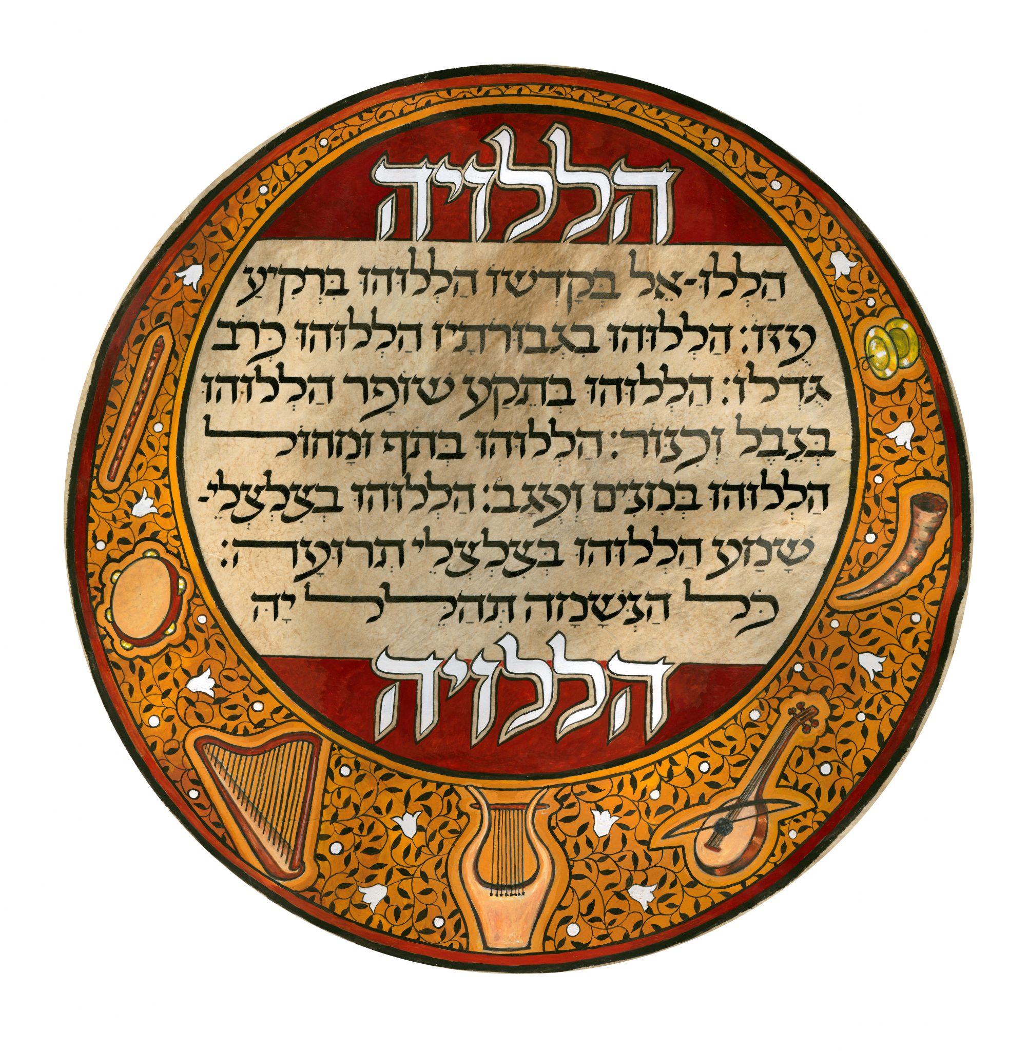
Naomi Teplow. Hallelujah (Psalm 150), 2010. Gouache on drum skin. 9 x 11 inches.
The traditional sacred craft of making Torah scrolls is complemented by the more flexible world of creative Hebrew calligraphy, aligned more with fine art than with liturgy. Kibbutz-born, Oakland-based calligrapher Naomi Teplow engages Psalm 150 calligraphically, like Sally Mae Joseph in the Saint John’s Bible. Over her dining room table, Teplow explained to me that her daughter was working on replacing an old drum skin. Teplow normally does not use animal skins for art, but she realized the drum skin would be perfect for Psalm 150, in which the psalmist envisioned an audience praising God “with tambourine and dance.” Teplow struck this drum not with palm or knuckle, but with nib and ink. The medium is the message. The form is the content. Teplow even emphasizes the same words as Sally Mae Joseph: the Hebrew “Hallelujah!” is the English “Praise Him!”
Jewish tradition has over many centuries developed rich practices of chanting the Bible. This is most evident in Torah services where even the mostly unpoetic passages are performed under the guidance of a series of tropes, notes, pauses, and emphases laid out over a millennium ago. These cantillation marks (te’amim) are written in Bible manuscripts and printed editions to this day. David Moss, an American-born Jew now living in Jerusalem, transforms these cantillation marks into playful colorful shapes in his Psalm 93.
David Moss. Psalm 93. 33 x 11 inches. ©2020 David Moss. Courtesy www.bet-alpha-editions.com.
Apart from the shapes of the cantillation marks, one strand of Jewish tradition elaborates on the shapes of the Hebrew letters, giving personality to their curves and lines. In The Book of Letters, Rabbi Lawrence Kushner tells one such story: Why, the ancient rabbis ask, does the Torah begin with the letter beit, which means “home”? Because we are meant to feel at home in the world, and the beit looks like a small house. Letters have personalities even apart from the words they dwell in.
French artist Michel D’anastasio infuses his Hebrew letters with gesture and movement, as in his Shalom, the Hebrew word for “peace.” These letters positively dance. If you can’t read Hebrew, you might get the effect even better—you can see the shapes of the letters without being distracted by what they mean. The thin lines around the letters, one of D’anastasio’s signature techniques, create a sense of movement. The letters’ diagonal slopes and their friendly closeness enhance the effect. The lamed, by far the tallest letter in the Hebrew alphabet, raises its arm in the air as if at a party.
The letter-body analogy goes deeper. When I worked as an art model in college, the teacher used my body to demonstrate that the average person’s height is seven times the height of his head. The proportions of the human body have been studied by artists for centuries. The rest of us may not know them explicitly, but as I found looking at the students’ work, we certainly notice when those rules are broken. Calligraphers too speak of proportions—often the proportion between the width of a broad-edge nib and the height of the letter. Wider nibs and short letters look squat and plump. Narrower nibs and tall letters are slender and lean. In the Roman alphabet from which the English language borrowed, perhaps the most archetypal letterform is the Roman square capital. Calligraphers learning how to write these typically work from text inscribed on Trajan’s Column, erected in Rome in 112–113 CE. Its letters are carved in stone, but when written with a nib, their height is seven to eight nib widths: seven to eight heads. Perhaps there is a reason these proportions look so right to the calligraphers and typographers who study these letters.
In all calligraphy, letters are forms, and form is content. Jewish tradition understands this in a special way: Jews have kept their connection to the language of their scriptures through communal ritual and individual emotion in a way that Christians in the Latin Church have not. Even the Reformers’ rejection of the Bible in Latin for a return to Hebrew, Aramaic, and Greek did not result in most Christian communities praying in those languages. The emotional and liturgical power of the scripture’s holy tongue, even when the ordinary believer no longer understands it, is perhaps why Jews have kept calligraphy alive. To generalize for a moment: if the written Torah scroll is the material locus of divine revelation in Judaism, for Christians the locus is not in words but in a person—the person of Jesus Christ. I am not suggesting that one is better than the other. I would suggest, however, that such theological and liturgical differences directly relate to how calligraphy means for Jews and Christians.
Christianity is thus more translatable than Judaism. Jesus speaks in all tongues, as the early church found at Pentecost. It may be not that Christians lack a holy tongue, but that Christ makes all tongues holy. The form is separable from the content. Perhaps this may be why Christians in the West let go of calligraphy as a sacred art for centuries, only for the Saint John’s Bible to rouse it again in the theology of the Word made flesh—Jesus—who, we can assume, was roughly seven head-heights tall.
Jonathan Homrighausen is the author of Illuminating Justice: The Ethical Imagination of the Saint John’s Bible (Liturgical), a doctoral student in Hebrew Bible at Duke, and a student of calligraphy. His writing has appeared in Religion and the Arts, Transpositions, and Visual Commentary on Scripture.