


Kizhi Island
KIZHI ISLAND IS REMOTE. Six hundred miles north of Moscow, it is a seven-hour ferry ride across Lake Onega from Petrozavodsk, a city of neoclassical stucco interspersed with gently decaying Soviet concrete. It is remote not only in space but also in color. In the height of summer its meadows constitute a splash of emerald under perfect skies that tint the surrounding lake in shifting hues, deepening from a blueish-white in the morning to a fully saturated ultramarine later in the day—the waters reflecting the heavens above. But in the depth of winter the landscape is transfigured. Color is blotted out, leaving only an intense white that renders the island almost invisible.
Kizhi is also the site of Russia’s most iconic wooden landmark. The Church of the Transfiguration is not a monument of extraordinary antiquity, but it is famous both for its isolation and because its twenty-two domes—each topped with a Russian cross—represent a high point of wooden architecture. Built of larch, pine, birch, and aspen, its shingles radiate a soft warmth when freshly hung in the brief summer months, weathering over the course of the long winter to the cold, hard austerity of silver.
Local guides recount the legend of Master Nestor, who built the church using nothing but his axe, which he then threw into the waters of the lake. By nature of both its origin myth and its construction, this architecture belongs to its specific site. Just as its materials were once rooted in the soils of the area’s forests, so its architecture is understood, according to its UNESCO designation, as being “in perfect harmony with the surrounding landscape.”
Yet this church represents a curious condition. It belongs not only to the immediate site of its construction but also to a place far removed both in time and in space. Built long after the fall of the Byzantine Empire, its architecture represents the survival of the global authority of Byzantium.

Church of the Transfiguration, Kizhi Island, Benjamin F. Zingg, Laban66 Creative Commons, used under license CC BY-SA 3.0.
As is typical for northern Russian churches, the towering design symbolizes an ascent to heaven, gesturing toward the open sky that extends beyond the boundaries of this remote island. And when the faithful pass beneath the crosses into the interior, which is raised above grade so as to lift the entrance above the winter snows, they encounter a space that is largely unfurnished. In the Russian Orthodox Church, the faithful stand to worship. But this space is not empty. It is populated by more than a hundred painted icons, their dimensions reflecting a personal appeal that is closely scaled to the human body. And it is here that the impact of Byzantium is most immediately palpable. It is visible, above all, in the color of the light—specifically, in the golden glow of the magnificent iconostasis, the screen of icons that separates the space of the congregation from the space of the altar beyond. It is a color quite distinct from that of the world outside. And it is, in a sense, a proprietary color. This interior glow is the light of Byzantium.
Byzantium owns a certain kind of light.
Indeed, the same light can be found in Constantinople’s sixth-century Hagia Sophia, the glory of Byzantium, its interior surfaces enriched by glowing mosaics and columnar screens that lead the eye onward toward spaces lit from sources unseen. The base of its dome is defined by a ring of light that causes the vaulting to float as if suspended from heaven. Writing soon after the church’s dedication, the Byzantine historian Procopius noted: “One might say that its interior is not illuminated from without by the sun, but that the radiance comes into being within it.” The visitor’s mind, he added, “is lifted up toward God.”
The color of Byzantium is the product of material, illumination, and devotional practice: darkness relieved by light, a form of communication that does not rely on words. The visitor who enters Kizhi’s Church of the Transfiguration is confronted not with spoken doctrine but with the iconostasis of gilded wood, a luminous surface that completely covers the eastern elevation, floor to ceiling, wall to wall, set beneath the typical so-called sky ceiling overhead
Illuminated by a variety of lamps and by small windows set into the depth of the wooden walls, the iconostasis plays an important role in Orthodox theology. It represents the interface between the temporal and the eternal, between the constraints of daily life and the vastness of eternity. It also represents a conviction that experience of the physical can open to a greater reality.
According to the traditions of the art, icons adopt recognizable formal types, the representative protagonists of the biblical redemptive narrative. Light and color are significant. On the southern door, Adam and Eve are created within the brightness of Paradise, but are cast into the darkness beyond after eating in disobedience of the tree of the knowledge of good and evil. Another icon in the bottom tier presents the approachable figure of the virgin Mary, enveloped in the distinctive ultramarine blue of lapis lazuli, the color of heaven. She stands here as a woman chosen for extraordinary favor: the scandal of Christian doctrine, bearing in her arms the embodied Christ, the new Adam.
Near Mary can be found the icon of the transfiguration, for which the church is named. It represents that moment in the biblical narrative when the radiance of heavenly glory shines through the body of the incarnate Christ. For the duration of just a few verses in the Gospel accounts, the glory of the eternal God is visible in the space of human experience—“he was transfigured before them, and his face shone like the sun”—and Christ’s disciples are overwhelmed by wonder. It is a moment when the ordinary is for a brief space of time overwhelmed by a transcendent glory. And it bears the promise of a transfiguration to come: the promise that the light of Christ will transform the darkness of the narratives of human embodiment, that the natural order of this world will one day be redeemed, and that those who bear the image of Adam may one day bear the image of Christ.
Christ is here presented in radiant white, the color of transfiguration. Indeed, he is to be understood as “the image of the invisible God,” as Saint Paul wrote to the Colossians. The Greek used here for image is εἰκὼν, icon. And this language participates in a larger array of associations. Just as Christ, the Word, is understood to be the image of God, so icons are understood to be words in painting, a visible gospel proclaimed in the language of colors.
The human body can itself be understood as an icon—the incarnate body of man, made in the image of God. And, to come full circle, it can be asserted that at its moments of greatest eloquence, the church building is also an icon, the material representation of a larger reality. All these things, in other words, point beyond themselves.
This is disputed territory. If the icon is understood as a likeness or image, the practice of the veneration of icons must confront the biblical prohibition articulated in the Hebrew text of the Ten Commandments, which stipulates that “You shall not make for yourself an idol [other translations use the term image], whether in the form of anything that is in heaven above, or that is on the earth beneath… You shall not bow down to them or worship them.” It is a reminder that no representation, however artful, can do justice to the glory of God; insofar as it falls short, it obscures rather than reveals the reality of a God who is glorious beyond all representation.
In fact, the icon has, across the centuries, been the object of violent confrontation—preserved in the very word iconoclasm, the breaking of images. Among the enduring charges laid before the icon is the accusation that in daily devotional practice veneration all too frequently inclines toward worship, and that the icon provokes idolatry, the worship of the created in lieu of the creator. But its defenders insist that when the faithful show reverence to an icon of Christ, the reverence is given not to the object of painted wood, but to the person of Christ himself. To quote Saint Basil the Great, “The honor paid to the image passes on to the prototype.” Basil illustrates his point by noting that respect shown to an image of the king is understood to communicate respect for the king himself—without thereby mistaking the image for the man.
In another, architectural analogy, the icon is understood as a “window to heaven.” Through the icon, the believer looks beyond the constraints of the immediate environment, so as to catch a glimpse of transfigurative glory beyond the space of ordinary experience. The physical opens to the metaphysical. The window frames the viewer’s attention—while itself remaining transparent.
Under the conditions of the early twenty-first century, this analogy has become easier to appreciate. For this, the faithful may thank Apple Inc. But the screen arrayed with icons is no longer that of the iconostasis, and the promise of transfiguration has shifted.
New York City
Apple is today not only the world’s largest technology company but also the world’s most valuable brand. It maintains a global network of stores, leading the way in retail sales per square foot, and an even more profitable presence online. In January 2020, announcing the company’s highest ever quarterly revenue, Apple’s CEO reported that more than 1.5 billion Apple products were in active use worldwide. “We see this,” he added, “as a powerful testament to the satisfaction, engagement, and loyalty of our customers.”
But to speak of loyalty seems insufficient. A better description might be devotion, measured not only in sales statistics or the length of processions forming on city streets for new product launches, but also in more personal registers. A surprisingly high number of people have inscribed the Apple logo onto their skin.
How does a company nurture such devotion? Identity is key. Apple’s logo, for one, incorporates no text; it is just an image, an icon, recognized around the world. Competing mythologies have grown up around its significance, many of them apocryphal—including association of the apple with the fruit of the biblical tree of knowledge. But when it comes to the experience of the Apple Store itself, as the physical embodiment of Apple’s presence within the city, the most visible element is light.
Apple owns a certain kind of light.
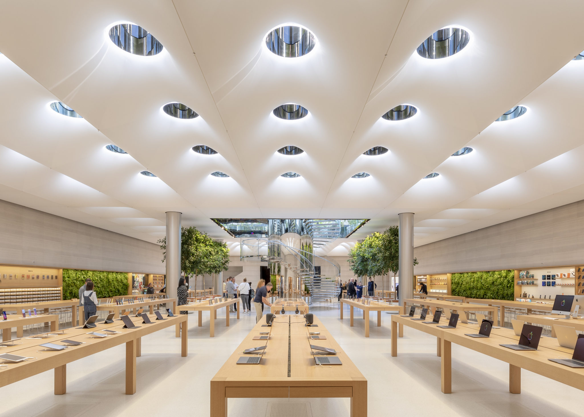
Apple Fifth Avenue, New York City, Aaron Hargreaves, Foster + Partners.
This is not only a figure of speech. The light is trademarked as part of Apple’s comprehensive retail design. The space of the store is bathed in a distinctive glow that is bright but not harsh, clear but not clinical, precise but not inquisitorial. It is neither too cool nor too warm. It is an atmosphere with a particular set of associations, a light that suggests that being part of this culture, owning these things, may be rightly associated with a certain sort of clarity, openness, and freedom—a lightness that is both literal and metaphorical, belonging also to the objects on display. It is not the dismal light of the lonely addict, hunched over a screen in the gloom of a darkened room. Nor is it the insipid light of the technocrat, quantified in the statistics of photometric output. This is, instead, a hopeful light, the glow of promise, even the radiance of happiness. It illuminates a narrative into which the Apple user is invited. And it is measured, in this instance, in the units of architecture.
This atmosphere is symbolically significant. The world outside may be complex and chaotic, but when you step inside, all is well—“perfectly controlled interiors, set off from the messy inconsistencies of the natural order,” to quote Vincent Scully’s Architecture: The Natural and the Manmade. The historian is here writing more generally about “the ideal world of interior space,” and he speaks in the same breath of Hagia Sophia. But here as there the interiors are perfectly controlled; this is Apple, which has developed its own operating system, collaborating with Foster + Partners, architects famous for obsessive attention to detail. Both parties aspire to architectural perfection, enforcing miniscule tolerances and controlling the design of the smallest components. Everything is designed to communicate perfectly with everything else, and also with you—for is that not part of Apple’s appeal? Inch for inch, these are among the most highly designed spaces in our contemporary culture, and they represent a global authority.
The nature of this characteristic brightness is not a mere by-product of window dimensions or daylighting strategies. Apple’s light is distinctive even when the store is fully interior, or buried underground. It is a product of comprehensive design, developed with care over the space of many years. Since the first Apple Store opened in 2001, the brand has updated its lighting concept five times.
In 2014, working with Foster + Partners, Apple patented its most recent lighting concept. That patent develops the idea of the lighted ceiling, described by lighting analyst Thomas Schielke as “the perfect sky.” Filed with the United States Patent and Trademark Office, patent 9,217,247 resolves the unsatisfactory darkness of the world of more ordinary spaces—the world of retail lighting as encountered outside Apple Stores.
Apple’s invention promises something better. In language typical of such documents, the patent speaks of its “embodiments,” the representations of its idea in tangible form. Lighting “may be designed so that its illumination conveys a desired character.” And this patent holder is in full control of that character. Apple’s lighting takes the form of a luminous surface that constitutes the entire ceiling, wall to wall. Its design cites the mid-century ceilings of corporate America—not least, the shadow-free space of Eero Saarinen’s 1956 Design Dome, the “holy place” of the General Motors Technical Center. But this invention is more sophisticated. Like Apple devices more generally, it generates its own brightness. One might say that the radiance comes into being within it.
Light here conspires with color. The whiteness of the ceiling is designed to communicate an image that is visually clean and consistent. Indeed, the significance of such details may be interpreted more broadly. Adopting a curiously doctrinaire vocabulary, the patent document notes that its descriptions “do not limit the embodiments to the precise forms disclosed. It will be apparent to one of ordinary skill in the art that many modifications and variations are possible in view of the above teachings.”
Indeed, the most palpable embodiment of these teachings is available not through the written word but through the experience of the Apple Store itself—the experience of light and color.
Apple is fully conscious of its place within the hierarchy of the contemporary city, and it has recently expanded its urban aspirations, presenting its stores as examples of genuinely civic spaces that shape community. Indeed, its Manhattan flagship is famous for being open to the public around the clock. It welcomed more than 57 million visitors between 2006 and 2017 alone. Apple Fifth Avenue is “Always Open.” And it is accessible! Entrance is free! All are welcome! Lifted above the surrounding city on a continuous podium reminiscent of a classical temple, and set against the marble colonnade of the General Motors Building behind, the clear glass cube that constitutes its (trademarked) entrance presents a stark contrast to the dark brownstone mass of a nearby church, visible three blocks to the south, its doors “currently closed to the public.”
When the store reopened in 2019 after its most recent rebuilding, senior architect Stefan Behling articulated a simple question driving its design intent: “Does it make you feel good?” This risks understating its ambition. According to Apple, the store is calculated to be “even more welcoming, and even more beautiful than ever.” Indeed, Apple is not shy about asserting that both products and properties are designed to “reflect the same standards of simplicity and beauty.” Such language is deeply embedded within Apple’s core values, articulated, with considerable earnestness, in the language of belief. Onetime chief design officer Jonathan Ive, who collaborated with Foster + Partners in reimagining Apple Fifth Avenue, speaks of the “profound and enduring beauty” to be found in bringing order to complexity. This ontologically resonant language refers not to transcendence over the chaos of mortal existence, but rather to the design of the icons on Apple’s screens, and, ultimately, to the perfection of Apple’s operating system, itself a promise of glories yet to come.
Visitors pass under the iconic Apple logo to descend a circular stair, its mirrored stainless steel chosen so as to “completely dematerialize the form.” This spiral circumambulation also guarantees a comprehensive overview of the splendors that await, laid out on the clean surfaces below. And here the characteristic architecture of Apple—the austerity of form, material, and color—heightens the impact of those moments of backlit glory, those small but bright displays, each arrayed with icons, beckoning to a better place, a different kind of freedom, a new brightness.
Visitors are welcomed by Apple Specialists. The company’s representatives mingle with the congregating public; but they are marked by a diminutive Apple logo “centered over the heart,” on a uniform of a cobalt blue carefully chosen to be both distinctive and approachable. In its origins cobalt is a modern substitute for ultramarine—cheaper, because synthetic: not reliant on the presence of genuine lapis lazuli.
Approachability and empathy are key requirements for prospective Specialists. Apple’s representatives must speak the vernacular of the people; indeed, the company notes with pride that Apple Fifth Avenue employees speak over thirty languages. Their task is to engage visitors on a personal level; and they move freely through the aisles, offering guidance and encouragement. The architecture supports this mission; within its lucid interior, there is no visible separation between the space of the Specialist and the space of the public. All occupy the same open plan, bathed in the same light, under the same perfect sky.
But then there is the Genius, who provides a higher level of care. Such personal intercession requires an appointment at the so-called Genius Bar. Etymologically, the Latin genius is the guardian spirit to whom the local altar is dedicated. And indeed, it used to be the case that the Genius Bar was evocative of an altar, disposed against a far wall: a closed form standing between Genius and public, at which the mysterious rites of vicarious digital redemption were performed. But in a shift reminiscent of historic changes to the design of spaces of worship, it now takes the form not of an altar but of a (patented) table, technologically sophisticated but formally simple, made of solid, unstained wood. All may gather around this table, for all are welcome here.
There is, of course, a motive behind Apple’s welcome. The communion of this community is directed toward a familiar end. Apple’s Genius training manual, leaked in 2012, documents a far-reaching mastery that is exercised not only through the crafting of space but also through the choice of words, the psychology of personal engagement, and the performance of precisely scripted narratives of technological redemption, all designed to foster a deeply personal satisfaction.
It is a commonplace to observe that the technology sector knows its public. Indeed, growing privacy concerns reflect fears that it already knows too much about those who submit to its authority. That knowledge spans the domains of both physical and virtual—perhaps even metaphysical—space. Individual histories and desires are noted, manipulated, and monetized. You might go so far as to say that your device knows you. Through careful coordination of hardware with software, of the tangible with the intangible, the mechanisms of fingerprint recognition have been superseded by facial recognition, incorporating some of the most advanced technology ever created. Such omniscience was, until recently, the attribute of God. “You search out my path and my lying down, and are acquainted with all my ways.” Today, in a comprehensive fulfillment of biblical promise, your iPhone, which counts your steps and is acquainted with your ways both public and private, will offer to route your path home and watch over your lying down. As Apple notes, the technology “recognizes if your eyes are open and your attention is directed towards the device.” It works “even in total darkness.” As the psalmist declares, more poetically, “the night is as bright as the day, for darkness is as light to you.”
The intimacy of knowing and being known has traditionally been distinctive of the relationship between the faithful and their God; today it marks the religious affectations of digital devotion.
The store substitutes for the sanctuary. There are no pews as such, because the faithful stand to worship. The space is designed for circumambulation, to allow for procession down the aisles, pausing at the various stations, where the objects of devotion are raised up, offering themselves as worthy of your veneration, objects that can be yours in a uniquely personal way—indeed, you might carry one with you at all times as a token of your devotion, close to your body. Images on the walls are designed to appeal to the faithful, but also fulfill a didactic function, because potential devotees are more likely to respond to images than to read texts. And again there is that clear, clean, hopeful light.
As Thomas Schielke notes, light is “an essential element for Apple’s brand communication.”
Indeed, Apple’s Fifth Avenue space is loftier than before—the floor was lowered during its renovations—but it is also brighter. It features what is perhaps one of the most sophisticated retail lighting schemes ever designed, a high point of architectural achievement. An array of skylights in a cloud-like ceiling draws natural light into the subterranean interior. But natural light is supplemented with advanced technology. As noted in a recent review by Bridget Cogley, “the ceiling is designed to change in order to match the color temperature outside. Thousands of LED lights and sensors make the store glow, from a blueish-white in the morning to a more golden tone later in the day.” The ceiling, in other words, represents a sublime mix of the natural and the manmade: the perfect sky.
The world outside is not quite like this—it is less perfect, its light ceding at times to darkness. Apple’s light, in contrast, is always on, bearing the promise of transfiguration. Yet it is arguable whether that promise will be fulfilled. It is ultimately, after all, an architectural fabrication.
Kyle Dugdale is an architect and historian. He has taught history, theory, and design at Yale and Columbia. This essay was developed as part of a workshop on religion and the built environment convened by the Center of Theological Inquiry in Princeton, New Jersey.


